Holly
Riding
Fine Art
Final
project proposal
Experimental
Portraiture
Review
The
skills, techniques and processes I have learnt and used in units 5
and 6 will show in my FMP. Working on projects earlier in the course
provided me with a variety of techniques such as using line and mark
making, using tone, observing, painting and drawing mainly from
installations made from junk. I also constructed an assemblage box,
and from this produced a piece using colours based on a limited
palette. Experimenting with grids, layers and reflections played a
huge part in my work, and as my ideas have progressed, will continue
as I carry on towards my FMP.
My
project will build on the strengths of my earlier work particularly
in the use of colours, layers, surfaces and composition.
Ideas
and Concepts
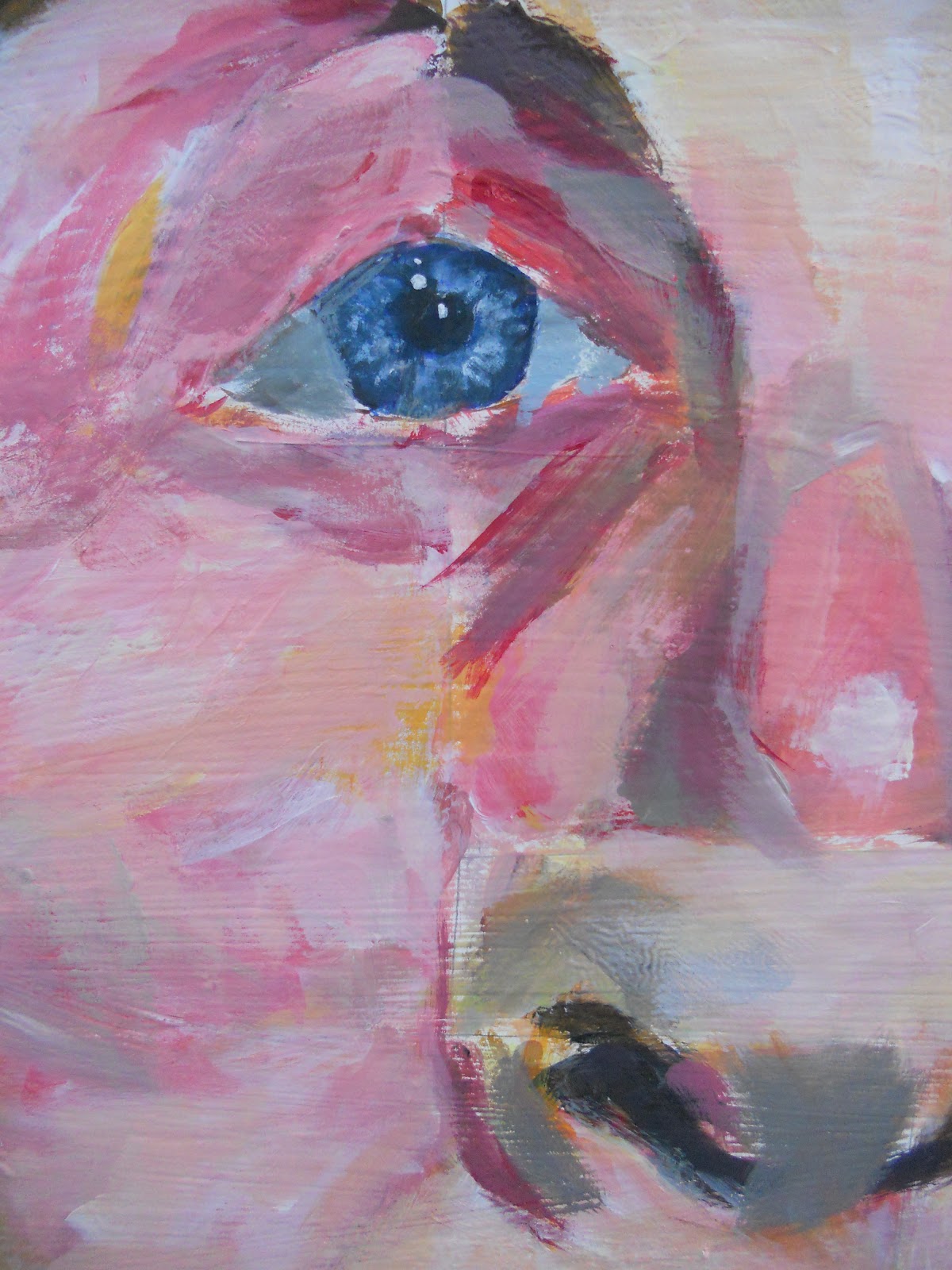
My
next step and aim is to explore the theme of portraiture, in doing so
I will emphasis the colour, surface and mark-making qualities within
the images, and push the work towards producing abstract paintings.
One idea I have is to produce and display canvas’s that investigate
the boundaries between figurative and abstract art. This will develop
in my work as I will create a body of work based around portraiture
and colour, using classmates and family as subjects to provide a
starting point. I am interested in a wide range of artists and want
to experiment with a number of alternative approaches to portraiture.
Contextual
Research
The
contextual research will help my understanding of the issues I am
dealing with and can influence my own pieces. The work of relevant
artists can give me a boost, well known artists such as Gerhardt
Ritcher, Lucian Freud, Willem De Kooning and Jenny Saville, can
suggest ideas and approaches. Individuals that work with not only
colour or portraiture but who show expressive abstract qualities in
their work are particularly relevant to me. I recently went on a week
long study visit to London which has helped me identify relevant
artists, and in addition to using the internet and library to find
out about other artists I will also use local galleries, as I now
realise that paintings are often very different seen in real life to
how they look in a book or on a computer screen.
Techniques
and Presentation
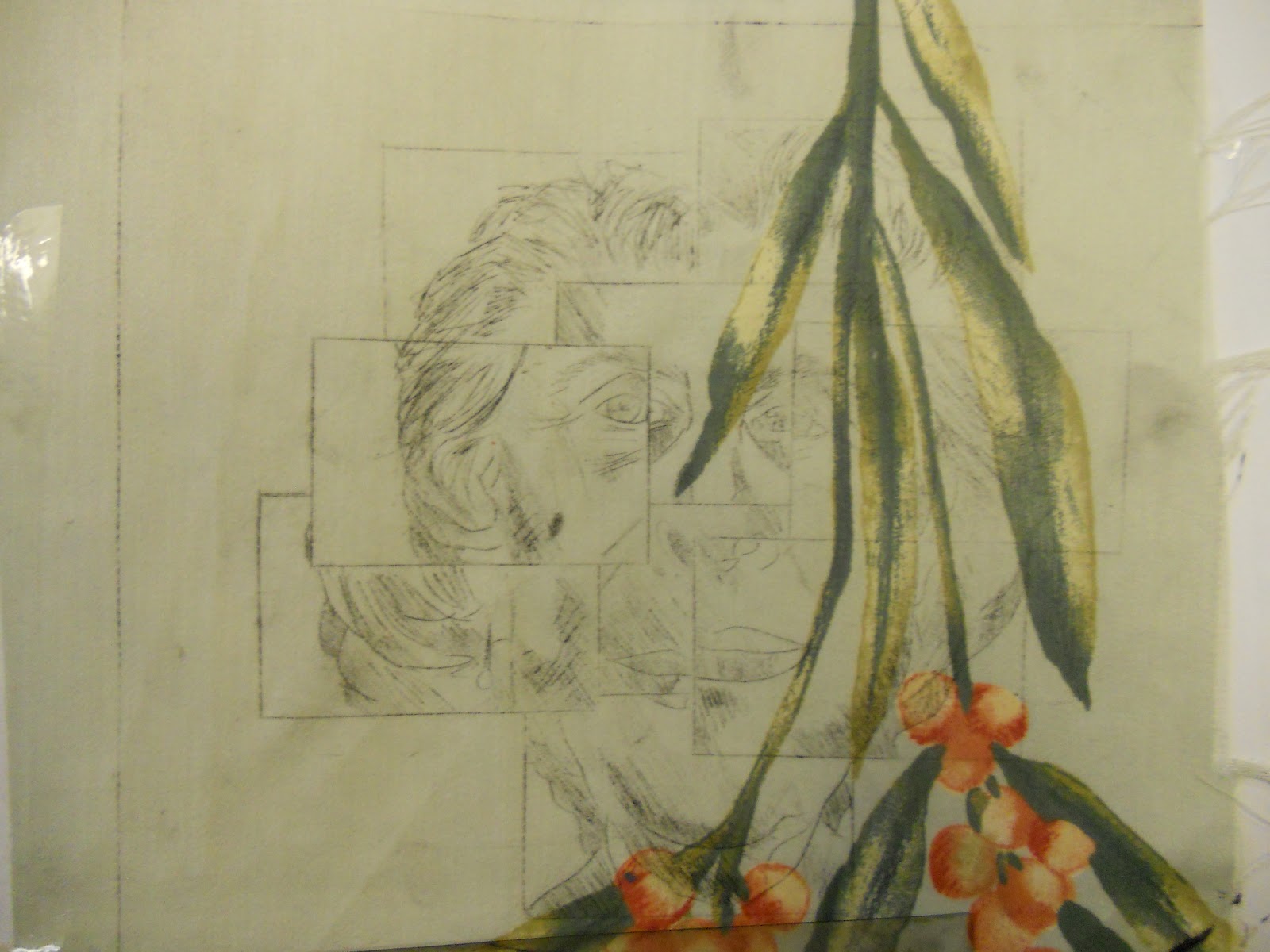
The
primary research I shall undertake will include a series of
observational drawings, photographs, and studies of family and
friends. This will be providing me with the chance of experimenting
in paint with colour, surface and layering, improving and developing
my painting style. The methods I can use to create and compose work
will be presented in my sketchbook, on a blog, or a journal, and by
doing so will show the audience the variety of my thought processes
and be able to evaluate my work as I go along. Using collage I can
create a raised, textured surface, this can add a further quality to
my work. I will be able to present or display my final pieces in the
exhibition, either as a series or sequence of inter-related small
images or a large scale painting.
Evaluation
and Progression
For
my evaluation I will gather feedback and helpful information that is
given to me, this will not only come from my tutors but also my
family and friends. The comments they have to share will help me;
feedback that I shall take on board will hopefully identify the
strengths and weaknesses of my work. Finally when I put up my
exhibition I will also compare my work back against the work of the
artists that have influenced me, to see whether I have succeeded in
developing work that has some of the qualities of their work.