Sunday 15 April 2012

Colour experimentation.

Working with plenty of ideas my experimentation was moving towards the usage of colour, looking at artists I researched in the past my biggest influence with exploring colour was Gerhardt Richter, his art as shown on my blog is extremely useful, the power of colour and composition has made Richter one of the best main artists in my work and also my FMP. 
Looking as colour I wanted to show a wide variety of  thoughts shown in a range of media.


 For the images above, instead of using acrylic I wanted something more interesting and different, I found some ink i thought would work well. As I started to produce my pieces, I added tissue paper and newspaper to give my work texture as well as detail, using my paint bush i wasn't intending on making the page neat, I enjoy showing expression in my work so  by using a paintbrush I freely displayed this using the colours I had.
I found the colours were generally easy to use but most of them blended in too easily leaving a dark dirty colour on some of my colour pieces, the ink I found left a sort of tie dye effect I found interesting and may want to use in my FMP work and development.


 The painting above is an inspiration and replicates the theme of a stained glass window.


For these colour experiments useing arcylic paint and acetate never did seem easier! 
Acrylic paint was basically squashed down using acetate, I didnt know how it would have turned out but I did create my own little abstract piece I found to be interesting, the colours I thought might have blended in better but I thought this worked well for a development/experiment piece.


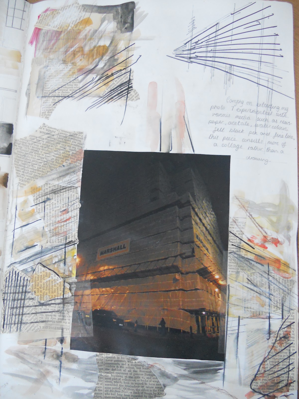
 Observing one photohgraph I took in Manchester sketching it out I created a simple line piece. I also added water colour and oil pastel to make the page stand out with alot more colour and tones.


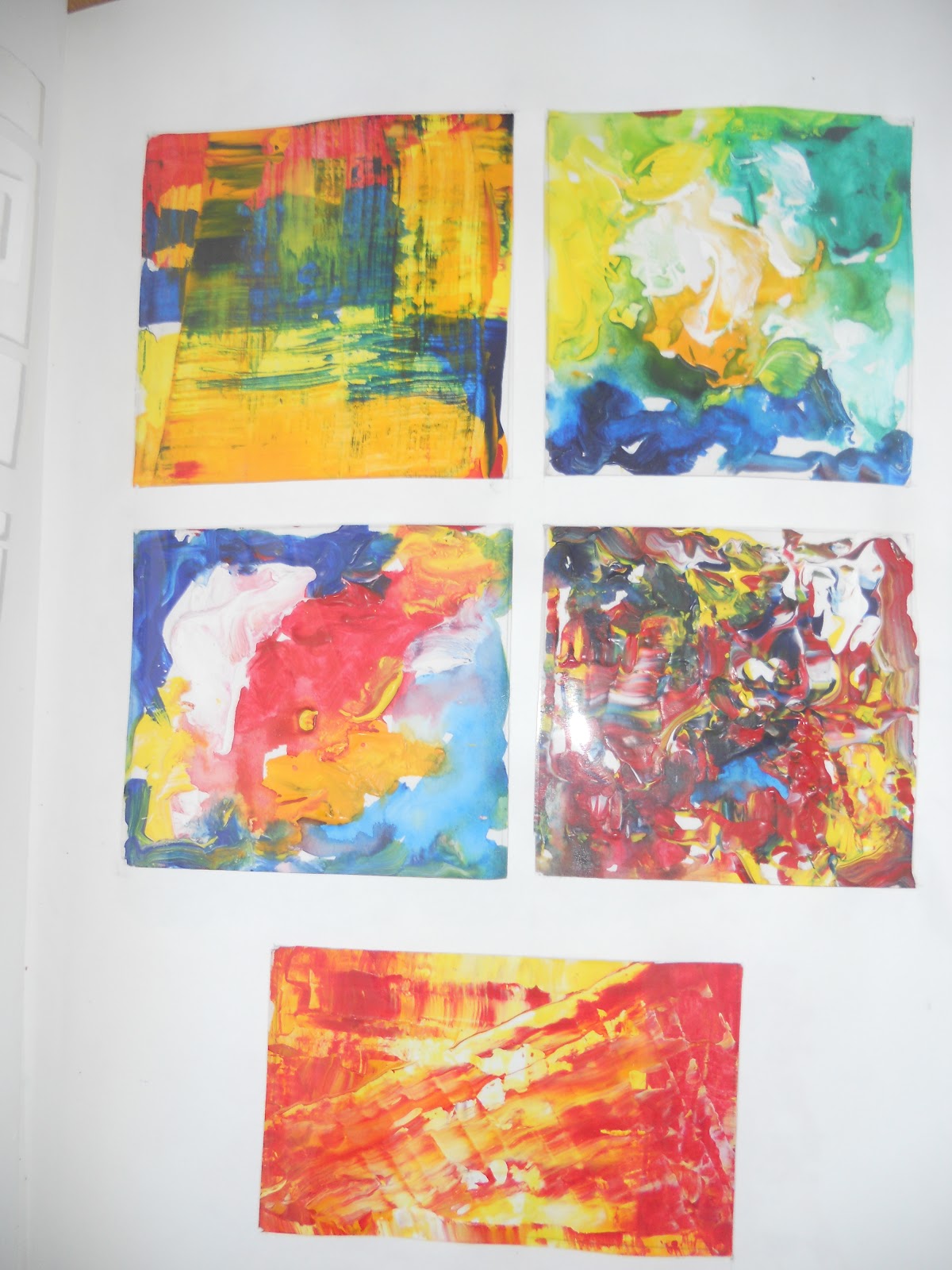
These  pages in my book remind me of Gerhardt Ritcher's work using his sqeegee to produce his art, the techniques I have used in these pieces give my page a range and variety in colour sampling and experimentation.

Wednesday 11 April 2012

Gerhard Ritcher

Artist Gerhardt Richter has been researched and relative techniques have been used in my work, he influences me as an artist due to the display of colour and intensity of his canvas's and paintings. For looking at abstract art I decided he could be the perfect artist as his work is very unique compared to any other.
 " Richter applied the paint in thick brushstrokes, or with rollers and an aggressive sweep of a squeegee (ironically, a tool commonly used for window cleaning and clarifying one's scope of vision). In this particular body of work, Richter minimized the visual impact of realist imagery in favor of a spontaneous, gestural illusion of space."

This is simply one of my own interpretations of Richter's work as i extended my photograph using his squeegee paint effect to create the complexity of bright and dark colours and layered composition.
Richter's main influences in producing his work come from the likes of Jackson Pollock, Andy Warhol and Lucio Fontana.
"With such an eclectic style, Richter is understandably influenced by artists as varied as Jackson Pollock and Andy Warhol. However Richter’s work, whilst seemingly incongruous, is highly personal and responsive."


Not only does Richter create expressive squeegee pieces but over painted photographs that inspire my work as I love the fact he tends to experiment with colour as do I since I particulary tend to focus on using different media to vary my work and understanding of skills when exploring artists work.


Grids layers and layers and reflections.

Part of my Unit 6 course-Beginning my Grids, layers and Reflections assignment showing ideas and processes throughout my sketchbook will help myself plus the audience know what I was thinking and how I went about going through the method. As I didn't know how or what to do experimenting was the only option to know my final outcome of the project, as a starting point drawing through windows, observing the basic line structure of buildings and the landscape, focusing on horizontal/vertical structure. 


Interested with the composition of buildings I held on to some photographs I took in Manchester of various areas in the city that I found remotely exciting, from these using a range of media, sketching, painting and collage from the photographs I developed a quantity of pages that displays the usage of colour, drawing techniques and skills of painting in different ways. 


Showing the direction of my method I extended this page with intentions of creating something other than focusing on a plain photograph in the middle of the page.
  • acetate, 
  • newspaper
  • Biro
  • fine liner 
  • water colour  
Using these main materials I wanted to give the page an expressive, feel I did create it quickly and wanted to display it in that manor.
Still focusing my thoughts on Grids the parallel liners and scrapped collage newspaper shows my experimentation of the chosen subject.


My watercolour page linking towards a back alley, the pale washy colours have blended and contrasted well with the stronger, bolder tones as I wanted sections of the page to stand out more than others, only adding certain colours to the sketch give the page a 3 dimensional effect with pen mark also slightly darker then others.


The next stages throughout my book was to more forward with my idea this meant working with ways I could use colour within various painting styles.


I took photographs of patterns I thought inspired me in the process of thinking about grids, layers and reflections. I extended these pictures to create my own version or designing a replicate in a more expressive way.

Monday 9 April 2012

London trip

Whilst in London, visiting many galleries gave me much inspiration as to what i could produce when thinking about developing my ideas for my up coming FMP, by doing so i found a number of the galleries very useful The National portraiture gallery with work from the likes of Graham Sutherland, (1903-80) , The Flowers Gallery with the work of John Keane, The Saatchi, Modern Tate and more...

Graham Vivan Sutherland
"One of a generation of students who, influenced by Samuel Palmer, revived the art of etching with a romantic vision of the English landscape. The Pembrokeshire coast became a lifelong source of inspiration and he developed a personal response bordering on the abstract. He contributed to the International Surrealist Exhibition in London, and became an Official War Artist. The Christian image of the Cross became a recurring theme and was commissioned in 1952 to design the Christ in Glory in the Tetramorph for Coventry Cathedral. His portrait of Churchill, to mark the Prime Minister's 80th birthday caused a sensation at its unveiling in 1954, and was subsequently destroyed by the sitter's wife." Click to see information

 (1903-1980), Painter. Artist associated with 23 portraits, Sitter in 54 portraits.)
"Drawn when the artist had mumps, when "my face was as fat as a football", which gave him the appearance of an arctic explorer or astronaut. Sutherland admitted to the influence of Picasso at this time, after seeing the retrospective at the Victoria and Albert Museum in 1946."  Click link to see quote

John Keane's work I witnessed at the Flowers Galleries on Cork street was an inspiration towards my up coming FMP as the style and techniques he used to produce his canvases impressed me, the materials used such as oil paints and linen gave the paintings a glossy textural effect with some of his work looking as if it was bulging off the canvas as though he has used plaster and tar to make the art look three dimensional, old and tattered. The canvases to me show a supernatural, mysterious feel due to some of the pictures having a blurry and misshapen effect also including dark subtle tones making his work look chilling.


 Some of Keane's work aka above inspires myself towards using mixed media to create textured paintings, experimenting with how I could compose my pages or even my Final Piece.


Sveta Yavorsky 

Hay Hill Gallery Cork street London.
 " After graduating from university, she took part in several exhibitions both in Moscow and abroad, eventually moving to London permanently. With the cultural change came a new direction in her work. Setting aside the architectural shapes, she started to concentrate more on the interaction of colours in her paintings, and the creation of a dynamic inner movement within the static composition of her figures. She carefully studied Kandinsky’s theory of colour, and developed from this her own idea of how colours and their various combinations affect the psyche." see info here

Below are some of my very own photographs i took while I visited various galleries in London...


Sveta Yavorsky's art is extreme, the rich boldness splashes out with clashing colours, captivating the audience towards the canvases she has created, her work also is something I may keep in mind as the layout of colour is various and bright, it displays as though in her work she uses a limited palette, as the arrangement of paint is carefully placed.


Wednesday 4 April 2012

My initial Ideas

My intentions in starting my FMP, I shall create work that is very interesting also showing my ideas and development throughout my book, by doing this it is showing my understandings of the two conclusions i could explore, i preferably would produce a canvas for my Final piece but my thoughts may change through the process of my development. I want my work to give the audience a glance of the techniques and research i will explore and to give them a view of a variety of ideas shown. 
I want to produce my FMP using two pathways instead of two ideas but my thoughts my change in due course.
Thinking of my theme, i feel Portraiture/ figurative art is what i enjoy the most, painting and drawing is my biggest strength but i would not be afraid to try out new methods and mixed media.
I want to aim for something I am very pleased also happy with that incorporates my thoughts from my sketchbook work which will link towards my Final Piece.

What i may focus on in my FMP:

Colour- ways in which it can be displayed when i am thinking of methods in which I could show it, colour wheel, contrasting comparing colours.

Texture- What materials i could use when I maybe experiment with collage, ways in which i work with painting plus mixed media displays.

Artists- Research and explore artists that are influenced by other artists and influential towards myself and chosen subject area . Not only to explore portraiture artists, but artists focusing with various painting styles, subject matters and materials. 

My contextual research will be important towards my ideas and guidance, the work of some of these artists Gerhardt Richter, Jenny Saville, Willem De Kooning, Lucian Freud will help me as they are well known, successful and too inspire my ways of working.